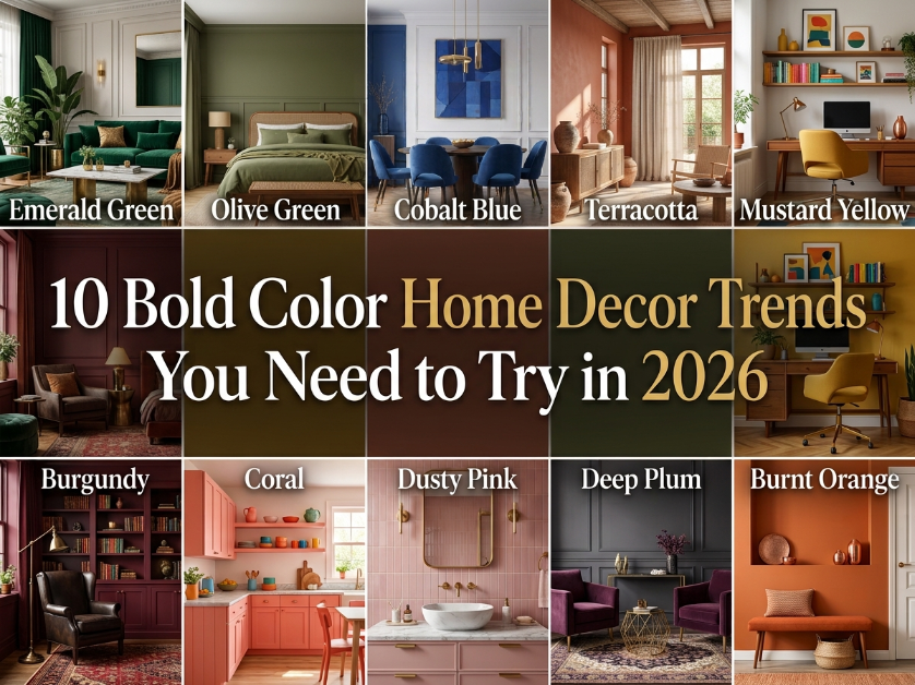
Ready to embrace bold color home decor? Discover fearless palettes, statement walls, and bold color home decor tips that transform any room. Get inspired now!
If your living room still looks like a blank canvas, it might be time to try bold color home decor. Neutral palettes have had their moment, but more homeowners across the U.S. are now reaching for deep greens, warm terracottas, and moody blues to give their spaces real personality. The truth is, going bold doesn’t mean losing balance or elegance in your home. When done right, bold color home decor can make a room feel warmer, more inviting, and far more memorable than another all white wall ever could.
1. Emerald Green and Warm Brass Accents
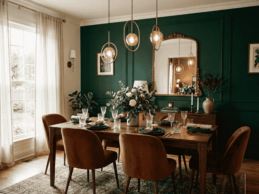
Emerald green paired with warm brass is one of the most requested combinations in bold color home decor for 2026. This pairing brings a rich, jewel toned depth to a room while brass hardware and fixtures add just the right amount of shine and warmth.
What makes this trend so popular across the U.S. is how versatile it feels. It works in older homes with traditional moldings just as well as it does in newly built, modern spaces. The green reads as sophisticated rather than overpowering, especially when brass accents are used sparingly.
Best Rooms for This Combination
Emerald green and brass shine brightest in dining rooms and home offices, where a deeper, moodier tone feels appropriate for the room’s purpose. A dining room with emerald green walls and brass pendant lighting instantly feels like a space designed for entertaining.
This combination also works well in powder rooms. Since these are smaller spaces used briefly throughout the day, they’re a low risk way to experiment with a bold color home decor look without committing an entire main living area to it.
How to Style It on a Budget?
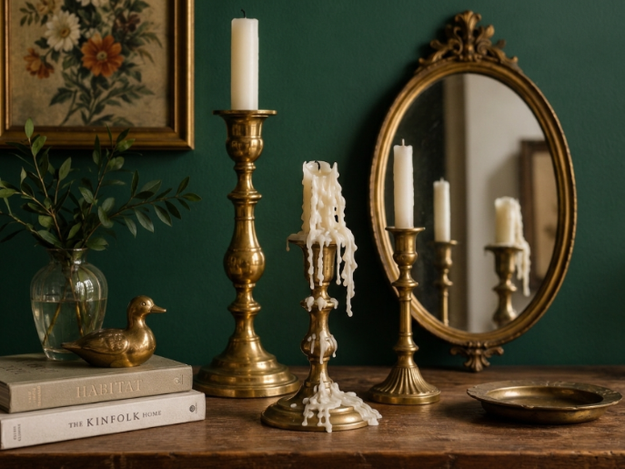
You don’t need to repaint an entire room to try this trend. Start with one emerald green accent wall, roughly 150 to 200 square feet depending on the room, and pair it with brass picture frames, a brass mirror, or brass drawer pulls.
Thrifted or vintage brass pieces are an easy, affordable way to get this look. A single brass floor lamp or a set of brass candlesticks from a local flea market can tie the whole room together for under $50.
2. Terracotta and Deep Navy Pairings
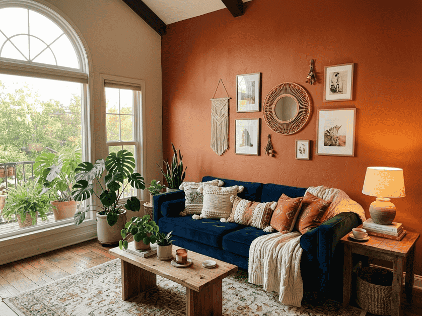
Terracotta and deep navy is a warm meets moody pairing that’s showing up everywhere in bold color home decor for 2026. The earthy, sun baked warmth of terracotta softens the intensity of navy, creating a combination that feels grounded rather than cold or harsh.
This pairing has become especially popular in the U.S. because it works well with the natural materials already common in American homes, like wood flooring, rattan furniture, and linen textiles. It doesn’t require a full renovation to feel intentional.
Why This Combo Works in North Facing Rooms?
Rooms that face north often get cooler, indirect light throughout the day, which can make navy feel flat or overly dark on its own. Terracotta counters that by adding warmth, so the room still feels inviting even without direct sunlight.
If your living room or bedroom faces north and tends to feel a little gray or dim, this is one of the most practical bold color home decor combinations to try. A terracotta accent wall paired with navy furniture keeps the space balanced.
Fabric and Furniture Ideas
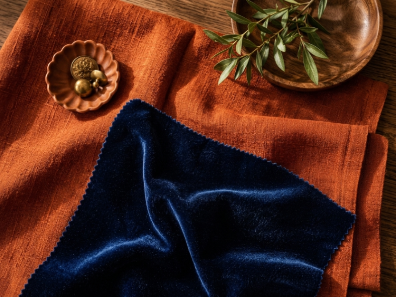
A navy sofa with terracotta throw pillows is one of the easiest ways to bring this trend into a living room without repainting. If you’re open to furniture shopping, a terracotta accent chair paired with navy curtains creates the same effect with less commitment.
For those on a tighter budget, a terracotta area rug, around 5×7 feet, layered against navy walls or navy toned decor can pull the whole look together for a few hundred dollars.
3. Burnt Orange With Charcoal Black
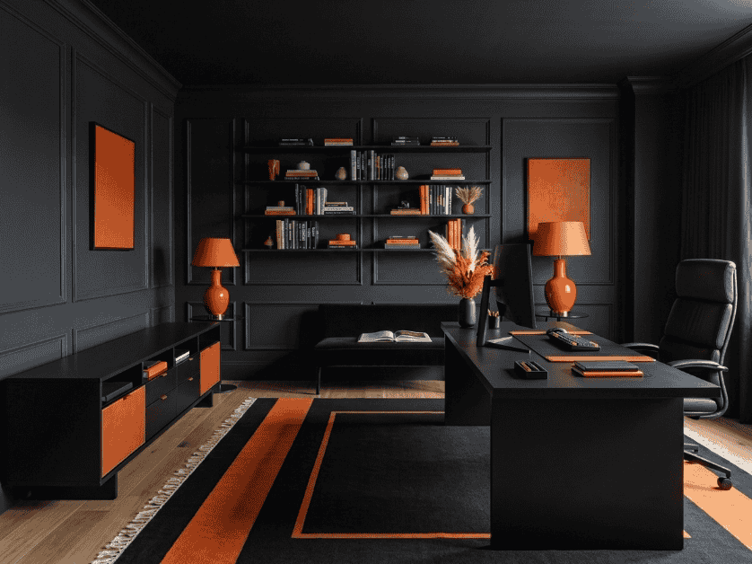
Burnt orange and charcoal black is the boldest, most dramatic pairing on this list, and it’s gaining serious traction in 2026 for anyone who wants their bold color home decor to make an immediate statement. The contrast between the two tones creates a striking, almost editorial look that photographs beautifully for Pinterest and Instagram.
This combination isn’t for every room, but when used with intention, it gives a space a confident, modern edge that feels far from generic. It works especially well in homes that already lean toward a moody or industrial style.
Balancing Bold Contrast Without Overwhelming a Room
High contrast pairings like this can quickly feel too heavy if overused. The key is to let one color lead and use the other as an accent rather than splitting the room evenly between the two.
A good starting point is charcoal black on the walls with burnt orange used through furniture, art, or textiles. This keeps the drama intentional while still giving the eye a place to rest, which is especially important in smaller American apartments and starter homes.
Where This Combo Works Best?
This pairing tends to work best in home offices, entryways, and media rooms, spaces where a bold, dramatic feel is welcome rather than something you need to relax in for hours at a time.
Entryways in particular are a great low risk place to try this trend, since a charcoal accent wall with burnt orange decor creates a strong first impression the moment guests walk through the door.
4. Bold Living Room Accent Walls
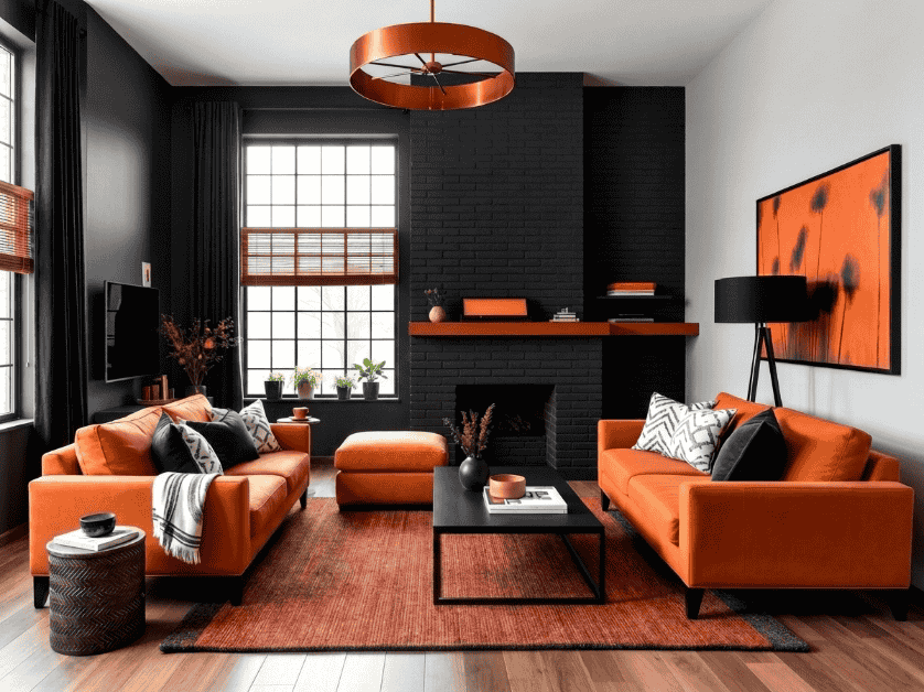
The living room remains the number one space where American homeowners choose to experiment with bold color home decor, and accent walls continue to be the easiest entry point. A single bold wall lets you commit to color without repainting an entire 300 to 400 square foot room.
This approach has stayed popular because it’s low risk and renter friendly in many cases, especially with the rise of peel and stick paint alternatives and removable wallpaper options widely available across the U.S.
Choosing the Right Wall to Accent
The best wall to paint bold is usually the one your eye lands on first when you walk into the room, often the wall behind the sofa, the fireplace wall, or a wall with architectural interest like built in shelving.
Avoid choosing a wall that’s broken up by too many windows or doors, since this can make the bold color feel scattered rather than like a clean, intentional statement.
Pairing Furniture With a Bold Wall
Once you’ve committed to a bold accent wall, keep the rest of your furniture relatively neutral so the wall stays the focal point. Think beige, cream, or light wood tones for your sofa and coffee table.
You can still tie the room together by repeating a smaller dose of your accent color through pillows, a throw blanket, or a piece of art, without letting it compete with the wall itself.
5. Cozy Bedroom Color Statements
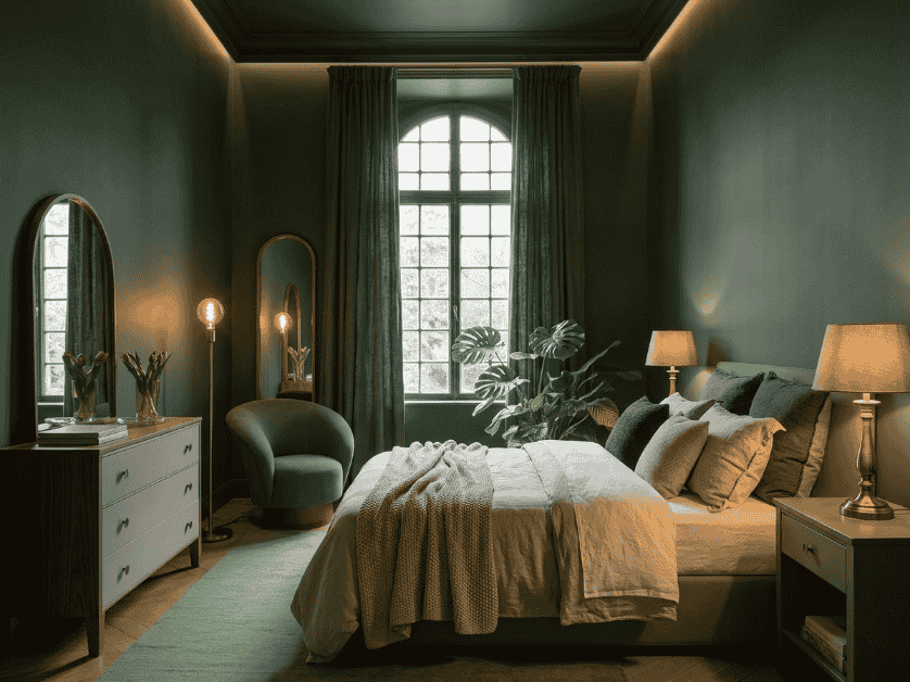
Bedrooms are one of the more surprising rooms embracing bold color home decor in 2026, moving away from the idea that bedrooms have to stay soft and neutral to feel restful. Deeper, richer tones are proving that a bedroom can still feel calming while making a real design statement.
This shift is especially popular among American homeowners looking to create a more hotel like, curated bedroom feel without hiring a professional designer.
Best Bold Colors for Better Sleep
Not every bold shade works well in a bedroom, since the goal is still to create a relaxing environment. Deep, muted tones like forest green, deep plum, or slate blue tend to feel cozy and enveloping rather than energizing.
Brighter, more saturated colors like fire engine red or neon shades are best avoided in the bedroom, since they can feel overstimulating in a space meant for winding down at the end of the day.
Bedding and Textile Ideas
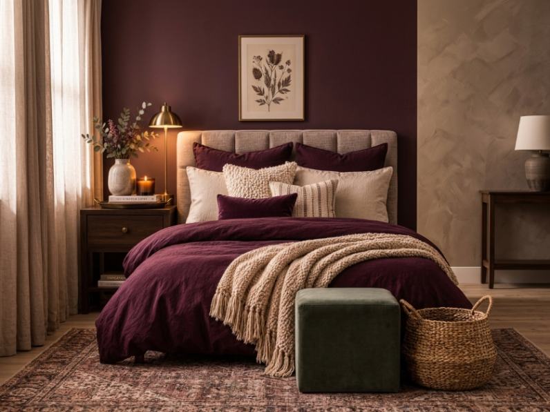
If painting an entire bedroom feels like too big a commitment, start with bedding. A deep plum or forest green duvet cover paired with neutral sheets brings the bold color home decor look to your bedroom without any paint at all.
Layering in a textured throw blanket or a few accent pillows in a complementary bold shade is another simple way to build up the look gradually, especially if you’re renting or not ready to commit to a full room redesign.
6. Kitchen Cabinets and Bold Backsplashes
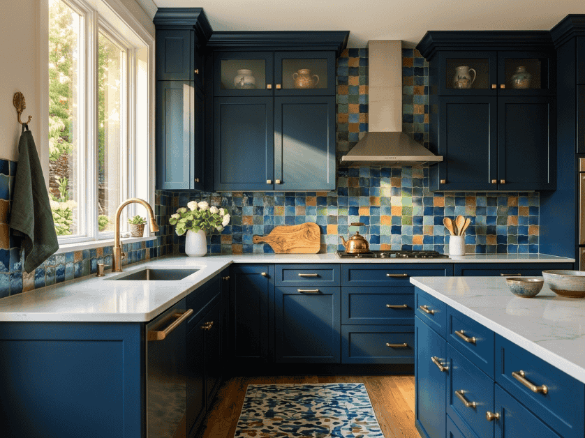
The all white kitchen is no longer the default, and bold color home decor is showing up in a big way through cabinetry and backsplash choices in 2026. More American homeowners are choosing color as a way to make their kitchen feel personal rather than like a builder grade showroom.
This trend has been especially popular in kitchen renovations and refreshes, since cabinets and backsplashes are two of the most visible surfaces in the entire room.
Popular Cabinet Colors for 2026
Deep forest green and navy blue continue to lead as the most requested bold cabinet colors, often paired with brass or matte black hardware for contrast. These shades feel timeless rather than trendy, which matters for homeowners thinking about resale value.
For those wanting something a little more unexpected, terracotta and deep burgundy lower cabinets paired with white or cream uppers are also gaining popularity as a way to ease into bold color without fully committing.
Bold Backsplash Tile Ideas
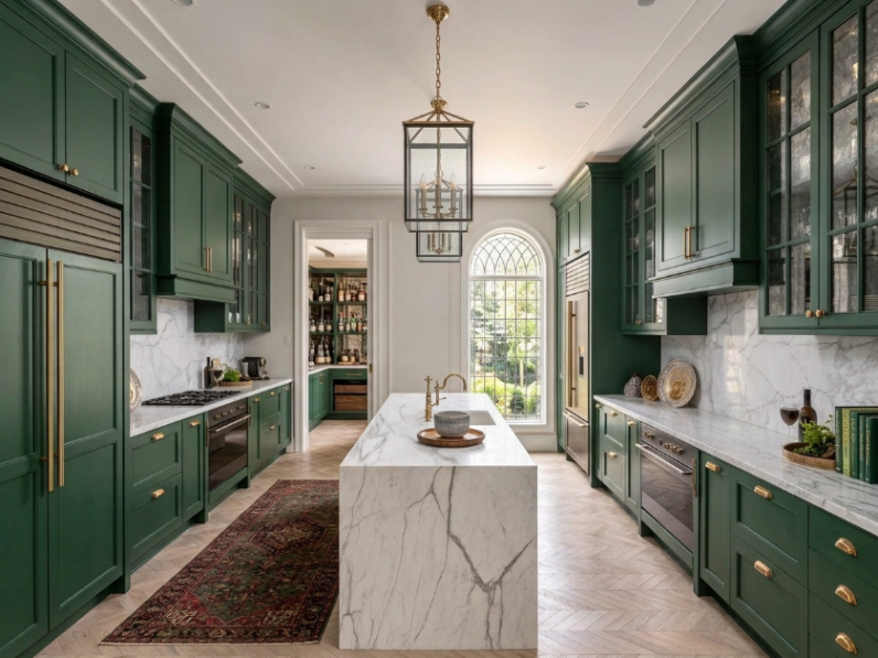
If repainting or replacing cabinets isn’t in the budget, a bold backsplash is a smaller, more affordable way to bring this trend into your kitchen, often costing a few hundred dollars for a standard sized kitchen.
Colorful zellige tile in shades of blue, green, or terracotta has become one of the most popular backsplash choices, since the handmade, textured look adds character even in a smaller 30 to 40 square foot backsplash area.
7. Statement Furniture as a Bold Color Anchor
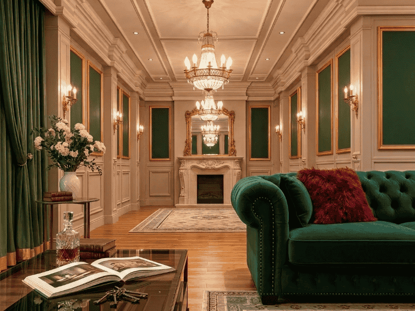
Not everyone is ready to paint their walls, and that’s exactly why statement furniture has become one of the most practical ways to try bold color home decor in 2026. A single bold piece can transform a neutral room without any long term commitment, which makes it especially popular among renters across the U.S.
This approach also gives you the flexibility to change your mind later. If a bold sofa or accent chair stops feeling right, it’s far easier to sell or replace than repainting an entire room.
Best Furniture Pieces to Go Bold With
A sofa or sectional is one of the highest impact ways to introduce bold color, since it’s usually the largest piece of furniture in a living room. An emerald green or deep blue sofa can instantly transform an otherwise neutral space.
If a full sofa feels like too big a step, a single accent chair in a bold shade is a smaller, more affordable way to test the trend, often costing a fraction of what a new sofa would.
Keeping the Rest of the Room Neutral
When you’re using furniture as your bold color statement, it’s important to keep your walls, flooring, and larger surfaces neutral. This lets the furniture piece stand out as intentional rather than getting lost among other bold elements.
A good rule of thumb is to treat your bold furniture piece the same way you’d treat a bold accent wall, as the one clear focal point in the room, with everything else designed to support it rather than compete with it.
8. Bold Color Through Textiles and Soft Furnishings
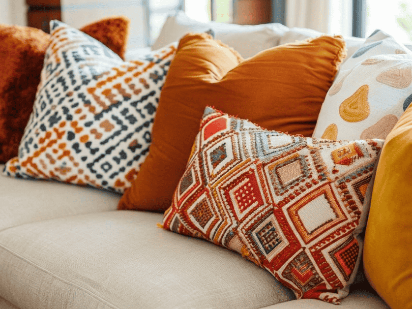
Textiles are one of the lowest commitment ways to try bold color home decor, which is exactly why they remain a favorite entry point in 2026. Rugs, curtains, and pillows let you experiment with color without touching a single wall or piece of furniture.
This approach is especially popular with renters and anyone who likes to refresh their space seasonally, since textiles are easy to swap out as trends or personal taste evolve.
Layering Multiple Bold Textiles
The key to layering bold textiles successfully is sticking to a cohesive color story rather than mixing too many unrelated shades. Pairing a terracotta rug with navy and cream pillows, for example, keeps the room feeling curated rather than cluttered.
A good starting point is choosing one dominant bold color and one supporting color, then repeating that same combination across your rug, curtains, and pillows so the room feels pulled together rather than random.
Budget Friendly Shopping Tips
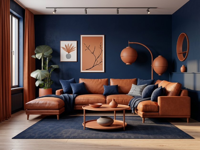
You don’t need designer textiles to get this look. Many affordable home retailers across the U.S. now carry bold colored rugs and pillow covers, with a standard 5×7 area rug often available for under $150.
Shopping secondhand or checking seasonal clearance sections is another smart way to find bold colored textiles at a lower price, especially since these pieces are easy to update again once you’re ready for a new look.
9. Removable Wallpaper and Peel and Stick Bold Patterns
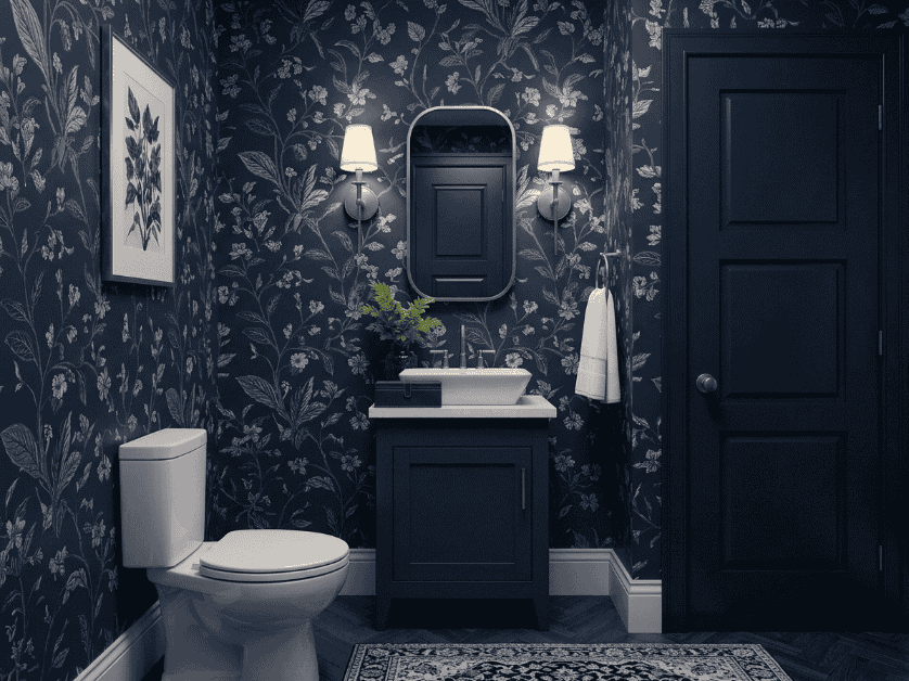
Removable wallpaper has made bold color home decor accessible to renters and homeowners alike, and in 2026 the peel and stick options available are more realistic and higher quality than ever before. This trend lets you add both color and pattern without the commitment or damage of traditional paint or wallpaper.
It’s become especially popular in the U.S. rental market, where many leases restrict permanent changes like painting, making peel and stick wallpaper one of the few ways renters can still make a bold design statement.
Best Rooms for Peel and Stick Wallpaper
Smaller spaces like powder rooms, entryways, and closets are ideal for this trend, since a bold, patterned wallpaper can feel overwhelming across a large 300 square foot living room but feels perfectly scaled in a smaller space.
Accent walls in bedrooms and home offices also work well, giving you the impact of a bold statement wall without needing to wallpaper an entire room.
Longevity and Application Tips
Most quality peel and stick wallpaper can last two to three years without peeling or fading, as long as it’s applied to a clean, smooth wall and kept away from excess humidity, like directly inside a shower.
Taking your time during application, smoothing out air bubbles with a squeegee tool as you go, makes a noticeable difference in how polished and long lasting the final look ends up being
10. Two Tone and Color Blocked Walls
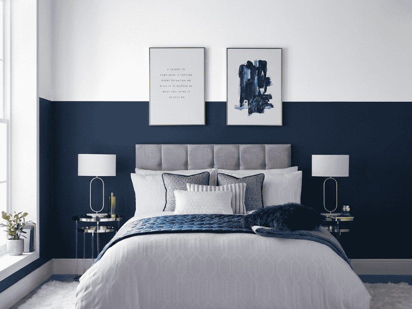
Two tone and color blocked walls represent one of the more editorial, design forward trends in bold color home decor for 2026. Instead of choosing a single accent wall, this technique uses two bold colors, or a bold color paired with a neutral, in a deliberate geometric or half and half pattern.
This trend has grown in popularity thanks to social media, where color blocked rooms tend to perform especially well on Pinterest because of how visually striking and shareable they are.
How to Plan a Color Blocked Wall?
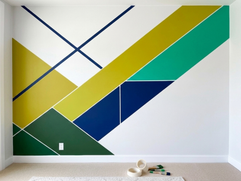
The most common approach is a horizontal color block, where the bottom half of the wall (usually up to about 4 feet high) is painted one bold color and the top half another, divided by a clean painter’s tape line.
Vertical color blocking, where two colors meet at a specific point along the wall rather than running the full height, is a newer variation gaining popularity for rooms with higher ceilings.
Best Color Pairings for This Technique
Pairing a bold color with white or cream is the easiest way to try this trend for the first time, since the neutral half keeps the room from feeling too intense. Navy and white or terracotta and cream are both popular starting combinations.
For those more confident with color, pairing two bold shades, like emerald green and burnt orange, creates a more dramatic, high fashion look that works especially well in dining rooms or home offices.
Common Mistakes to Avoid With Bold Color Home Decor
Even with the best intentions, bold color home decor can go wrong quickly if a few common mistakes aren’t avoided. Knowing what not to do is just as important as knowing which colors and combinations to try.
These mistakes are especially easy to make for first timers who get excited about a trend without thinking through how it will actually work in their specific space.
Overusing Too Many Bold Shades at Once
One of the most common mistakes is trying to incorporate too many bold colors into a single room at the same time. When every wall, piece of furniture, and accessory competes for attention, the room can start to feel chaotic rather than intentional.
A safer approach is to choose one or two bold colors per room and let everything else stay neutral, allowing your chosen colors to actually stand out instead of getting lost in visual noise.
Ignoring Undertones and Color Temperature
Every bold color has an undertone, whether it’s warm, cool, or somewhere in between, and ignoring this is a common reason bold color home decor choices don’t turn out as expected. A navy with cool undertones can clash with warm wood flooring, for example.
Before committing to a paint color, it’s worth testing a sample swatch, roughly a 2×2 foot section, directly on your wall and observing it at different times of day, since lighting can significantly change how a bold color actually reads in your space.
FAQs: Bold Color Home Decor
What is the best bold color for home decor in 2026?
Emerald green, terracotta, and deep navy are the top bold color home decor choices for 2026. They pair naturally with wood tones and brass accents common in American homes, making them easier to incorporate without a full renovation.
Is bold color home decor still in style, or is it fading?
Yes, bold color home decor is still trending and growing in popularity. Homeowners continue moving away from all neutral interiors toward spaces with more personality, and this shift is expected to continue past 2026.
What colors pair well with bold home decor accents?
White, cream, and warm wood tones pair best with bold color home decor accents. These neutrals balance the intensity of the bold shade, while brass or matte black hardware adds contrast without competing for attention.
How do I add bold color to a small room without overwhelming it?
Start with one accent wall, furniture piece, or textile like a rug or pillows instead of painting the whole room. Sticking to one dominant bold color keeps a small space feeling intentional, not cluttered.
Does bold color home decor increase home value?
Yes, when done with timeless shades like deep green or navy. Overly saturated or trend-heavy colors used throughout a home may require repainting before resale, so moderation helps protect long term value.
What’s the difference between bold color decor and maximalism?
Bold color home decor uses strong, saturated colors intentionally within a space. Maximalism is broader, layering color, pattern, and decorative objects together. Bold color decor can exist on its own without going fully maximalist.
How much does it cost to redo a room with bold color decor?
Costs range from $50 to $100 for a single painted accent wall, up to $150 to $300 for textiles like rugs and pillows. This makes bold color home decor accessible at almost any budget.
Is bold color home decor better for renters or homeowners?
Both can use this trend effectively. Renters typically lean on textiles, furniture, and removable wallpaper, while homeowners have more flexibility to repaint walls or update kitchen cabinets for a permanent bold color statement.
Conclusion
Bold color home decor is an easy, budget friendly way to bring personality into any American home. Whether it’s a full accent wall or a few bold pillows, there’s a low risk starting point here for every budget and room.The key is intention: pick one or two shades you love, keep the rest neutral, and let your space feel like you, not just a trend.
Loved these ideas? Save this post to Pinterest and let us know in the comments which bold color home decor trend you’re trying first!

One thought on “10 Bold Color Home Decor Trends You Need to Try in 2026”